Mid-century rooms can be brutally honest. Clean lines. Crisp edges. A little too proud of how little they need to look “done.” That restraint is the magic—until you live in it for a while and notice the sharpness. The glare. The way every hard surface seems to bounce light right back at you.
“Bright and airy” gets pitched as the cure for everything, but half the time it reads like a rental listing. Underlit corners, cheap-white paint, shiny finishes, and nothing with enough depth to look intentional. Moody, textured rooms don’t just photograph better—they feel finished at 7 p.m. on a Tuesday.
Softness can happen without turning your home into a staging closet. Fewer objects. Better materials. A little darkness. More control.
Awkward rooms don’t want more decor—they want a better plan
Before adding anything “cozy,” strip the space down mentally: furniture, lighting, and circulation. That’s the real design. Everything else is garnish.
Across too many homes, the same issues show up:
- seating that doesn’t face anything
- pathways that cut through the room like a shortcut
- surfaces doing double-duty as storage because there’s nowhere else
A new throw pillow won’t fix a pinched walkway. A basket won’t fix a room with no focal point. Mid-century asks for clarity—zones that make sense, pieces that belong, negative space that feels deliberate.
On nights when you’re tired and the room is a mess, the layout either supports you or it doesn’t.
Reflectivity is what makes a room feel “cheap bright”
Polished finishes are loud. They reflect everything you didn’t mean to highlight: overhead glare, fingerprints, the pile of mail you swore you’d sort.
High-gloss lacquer is the classic trap. Looks incredible in a styled photo. In a west-facing room, afternoon light hits and the whole wall becomes a mirror. Smudges show up like they’ve been outlined. (And yes, you’ll end up wiping the same cabinet door three times in one day, annoyed at yourself each time.)
Honed soapstone is the opposite energy. Velvet-like to the touch, visually quiet, and forgiving in low light. Same story with honed marble or a matte limestone—less sparkle, more depth.
Polished dark stone deserves a special warning. Water spots show immediately. Smears ghost across the surface. In a bathroom vanity or kitchen island, it’s constant. Honed finishes don’t perform miracles, they just don’t tattletale every time someone washes their hands.
Organic materials that don’t drift into “rustic craft fair”
Distressed wood and “farmhouse warmth” can swallow mid-century whole. Organic softness works best when it stays tailored.
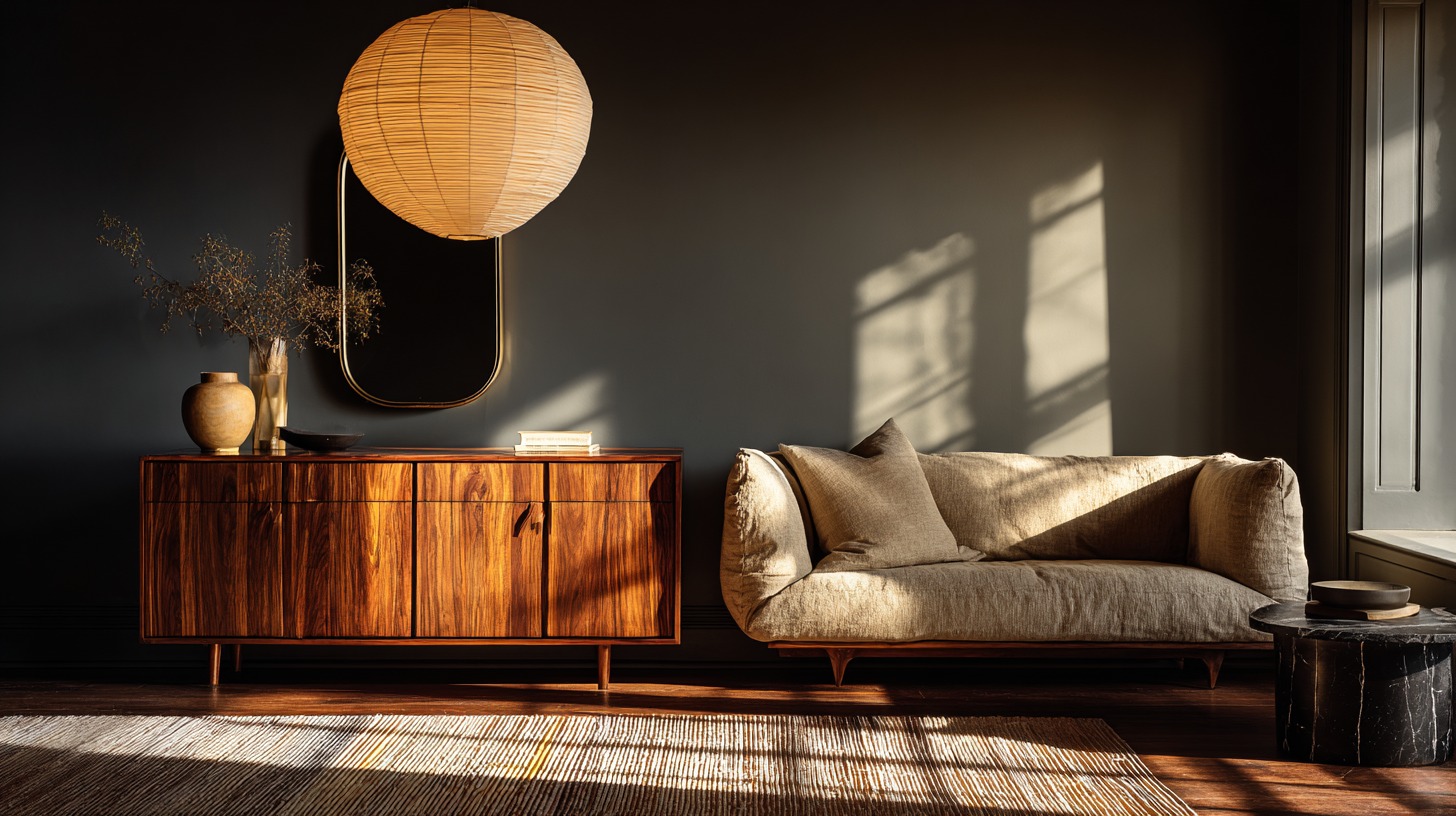
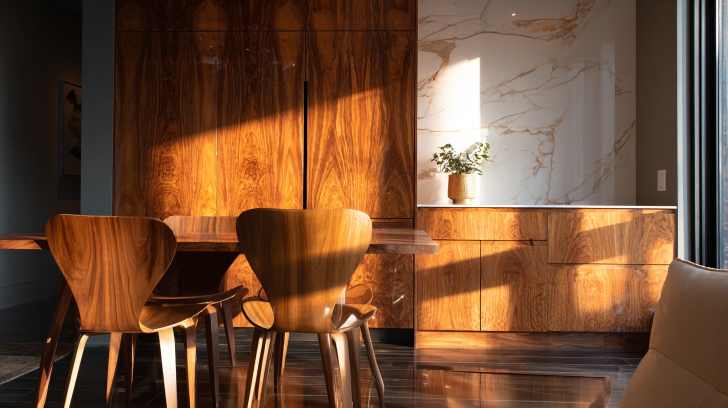
Walnut is a perennial favorite for a reason—dense, grounded, and handsome in dim light. Teak and white oak do the same job in a lighter register. The key detail: mixed wood tones need repetition. One random oak piece in a walnut room looks like a hand-me-down. Two oak notes look like a decision.
Stone should feel calm, not glittery. Slate, soapstone, honed marble, limestone—materials that absorb light instead of bouncing it.
Textiles help, but only the ones you’ll live with. Linen bedding looks better slightly rumpled. Wool throws add warmth without looking fussy. Bouclé is great in small doses; too much bouclé starts to feel like you bought a trend and it moved in.
Curves belong in the room—just not everywhere
Arched shapes soften mid-century geometry fast: a rounded mirror over a console, a curved chair back, a drum shade. One curve can relax an entire zone.
Too many curves and the room loses its spine. Mid-century is allowed to be crisp. Let it.
Color that holds up after dark
Pure white walls are rarely “clean.” They’re just exposed. Bright-white rooms tend to look unfinished unless every material and object is top-tier (and most homes aren’t trying to cosplay a gallery).
Moody palettes read richer because they hide seams. Shadows look intentional. Corners stop feeling empty. A deep wall color can make an ordinary room look designed instead of decorated.
Start with a warm base: bone, sand, soft taupe, warm gray.
Add an earthy warmth: clay, tobacco, muted ochre, terracotta undertones.
Anchor the room with depth: ink, espresso, deep olive, charcoal.
Dark doesn’t have to mean cave. It means control. It means letting texture and light do something interesting.
Texture: two strong moves per zone, then stop
Texture is the easiest way to add softness. It’s also how people accidentally create clutter, just in fabric form.
Dense rug + upholstery with “tooth” works in a living room.
Linen bedding + a wool layer works in a bedroom.
Plush towels that dry fast + a matte surface works in a bathroom.
Runner + upholstered bench works in an entry.
Five textures in one zone turns into styling. Two textures that repeat turns into a home.
Styling that doesn’t become a full-time job
Small objects multiply. That’s how “minimal” shelves turn into dust museums.
Heavy ceramics, a sculptural lamp, a single bowl with presence—those choices calm a surface down. Tiny candles, stacks of books, trays on trays… that’s just visual noise with good intentions.
A very real struggle: a big walnut credenza looks incredible until you try to move it even an inch to re-center it. It’s a two-person job and someone always suggests “just leave it” halfway through. Scale matters, but so does livability. When in doubt, go slightly lighter on the biggest pieces so the room can evolve without a hernia.
Lighting that makes the room look expensive
Overhead lighting alone makes rooms look flat and cheap. It’s harsh, it emphasizes shine, and it kills mood instantly.
Warm, layered light changes everything:
- a diffused pendant (modern paper lantern styles are surprisingly good here)
- a shaded table lamp placed low so it throws light sideways
- task lighting where you actually need it
Control matters more than people think. Lutron Caséta dimmers are the boring, practical upgrade that makes a space feel intentional every single night. One dimmer can do more for a room than another “accent piece.”
High-use spaces need softness that behaves
Bathrooms, kitchens, entries don’t care about your vibe. Water, scuffs, steam, and daily chaos show up anyway.
Brushed nickel and brushed brass hide fingerprints better than polished chrome.
Matte tiles and honed stone hide water drama better than high polish.
Drawers beat trays when you want a counter that can reset quickly.
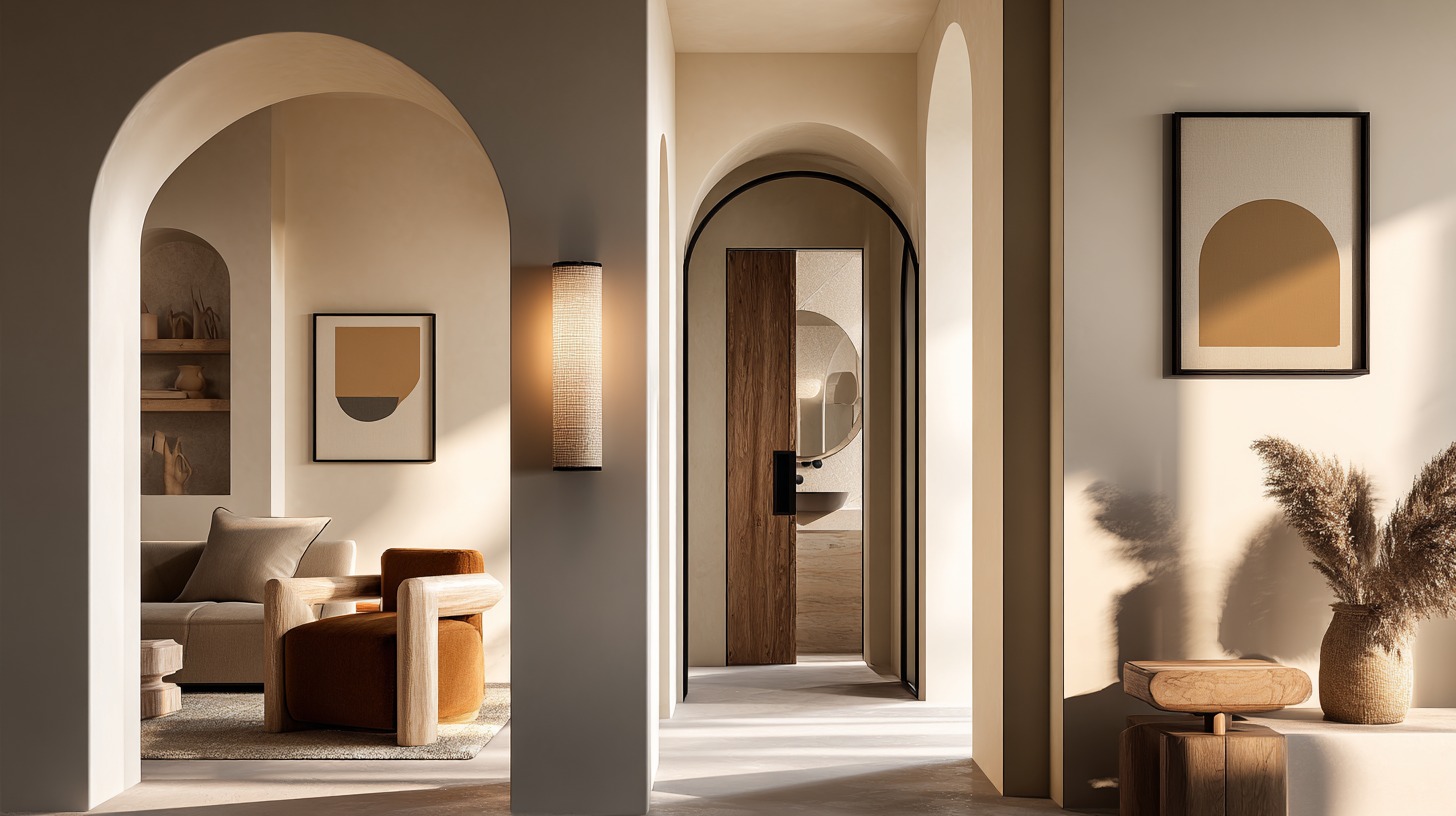
A practical example of this balance—mid-century order with softer, organic materials—lives here: mid-century inspired calm-home ideas
Room-by-room: the calm version of “mid-century meets organic”
Living room
Start with one upholstered anchor that invites real lounging, not polite sitting. Add a dense rug that quiets the room and grounds the furniture. Repeat a wood tone in at least two places so it reads intentional. Then leave space. Open surfaces make a room feel expensive.
Coffee tables become dumping grounds in real life. Storage helps. A lower shelf helps. A tray helps only if it has a job and doesn’t become a junk corral.
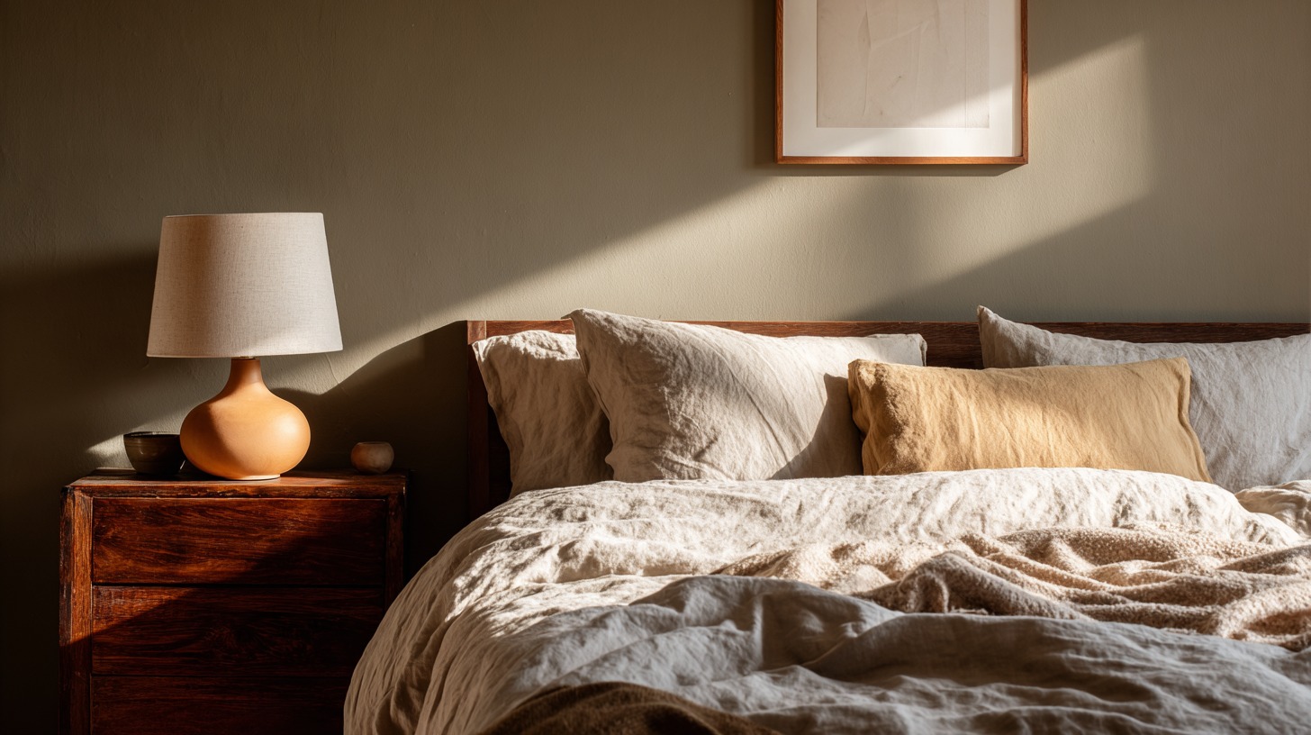
Bedroom
Linen bedding earns its keep. It looks better lived-in, not worse. A wool layer adds warmth, especially when the room leans dark. Gentle night lighting keeps the space from feeling like a hospital room at midnight.
Chargers, cords, random clutter—solve it with a drawer and a lamp, not with “bright white” pretending it’s clean.
Bathroom
Counters want honesty. If the only way the vanity looks good is with a styled tray full of objects, it won’t look good tomorrow morning.
Honed surfaces, brushed metals, and flattering lighting do the heavy lifting. Textiles should feel good and dry fast. Nobody wants a bath mat that stays damp for six hours.
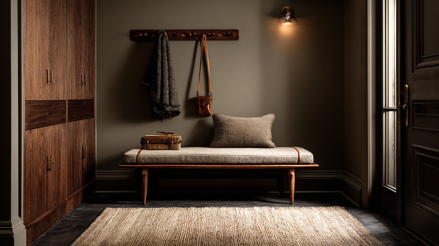
Entry
Entries reveal everything about how a home actually works. Shoes need a home. Bags need hooks that are reachable. A bench makes the routine easier. A runner makes it quieter. Quiet is underrated.
A quick reality check
Reset speed tells the truth.
Daily items need actual homes.
Materials should repeat.
Nighttime should look better than daytime.
Moody, textured spaces don’t feel cheap because they don’t look unfinished. They hold their shape when life gets messy. That’s the point.